Cicil.co.id

2021

Revamp

Mobile

New Cicil Price Simulations and Checkout Experience

Cicil.co.id

2021

Revamp

Mobile

New Cicil Price Simulations and Checkout Experience

Cicil.co.id

2021

Revamp

Mobile

New Cicil Price Simulations and Checkout Experience

Role

Product designer

Duration

2 Month

Platform

Android

Team

Product researcher, Product manager

Background

CICIL is one of the biggest education funding companies in Indonesia. Our goal is to facilitate students' needs to ensure they have everything necessary to excel in their education. While student loans are popular in the US, they are a new concept for Indonesian citizens.

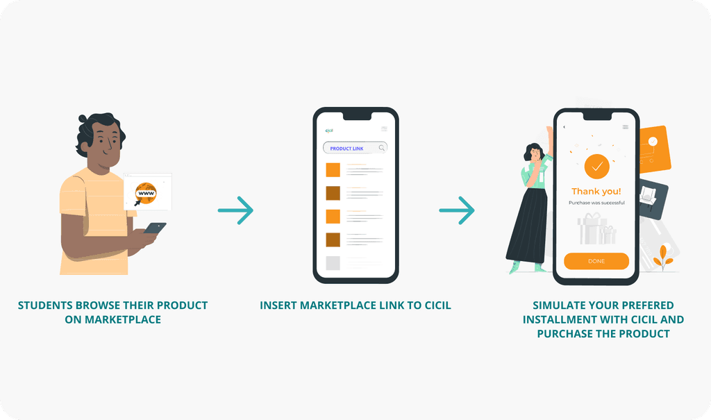
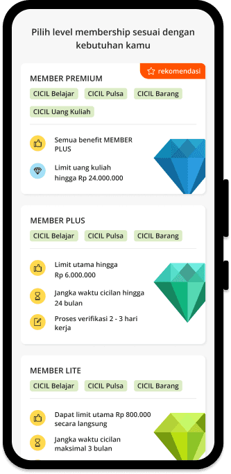
How cicil works

Chapter 0. Synopsis

Chapter 0. Synopsis

Problems

Problems

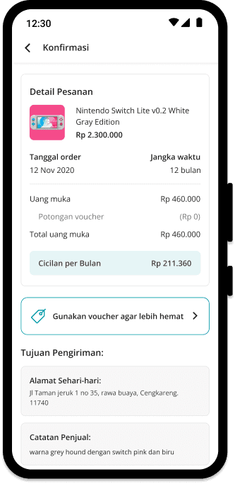
The existing checkout page was plagued by difficult loan terms and a cluttered design. The inability to switch links when students wanted to try another simulation also contributed to a ridiculously high drop rate. Confusing installment and limit information disturbed the price simulations and checkout experience.

Objectives

Objectives

- Improve the visuals of the new checkout page with a new design system and fix all the UX and content structure problems.
- Make the informational structure better for existing and new users
- Decrease bounce rates and user complaints about unclear loan structure information.

Challenges and Constraints

Challenges and Constraints

This was my first major redesign project and also one of the most important parts of CICIL's product journey. I had to manage this project while I was only five months into product design, and all the research was done during early COVID-19. The research process was difficult because we needed to conduct all interviews and usability testing using online tools.

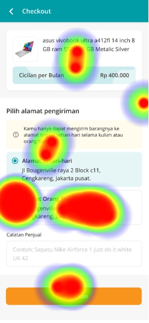
Old checkout page with a lot of unclear structure of number calculations

Old checkout page with a lot of unclear structure of number calculations

Chapter 1. Understand

Chapter 1. Understand

Chapter 1. Understand

Research, interviews and data.

Research, interviews and data.

This project started with limited resources for research because CICIL only had one researcher with an unstructured research method. Therefore, I started the project without in-depth user research. I looked for several sources of information such as research results from PMs, interviews with stakeholders, and expected targets from the designer's side. I initiated concept testing to users to get immediate results in the form of data.

Context gathering

Context gathering

To understand the product deeply, I initiated talks with the product manager. These conversations generated a lot of information about how our margin counts.

Concept testing with Maze

Concept testing with Maze

Conducting online usability testing was new due to early COVID-19. We tried concept testing with Maze and generated significant data.

Re-iteration from testing

Re-iteration from testing

After concept testing, the design direction was clearer. We understood the design objectives.

Research: Maze usability testing

Research: Maze usability testing

Concept testing the first iterations yielded:

I initiated this concept testing together with the product researcher. Using the maze as the main tool due to the limited situation (Pandemic). Then we also followed up some users by doing online usability testing along with simple interviews. This research also produced quite satisfactory results because we got enough insight to continue this design process.

85,3%

Success rate

14,7%

Bounce rate

10,5%

Misclick rate

34.7 (s)

Avg duration to success

What we learned so far?

What we learned so far?

  • Some loan/financial terms were difficult to understand, and users just wanted to know the installment amount.

  • Users liked to try different links from different price sellers, contributing to a high drop rate.

  • The drop rate was reduced from 70% to 20% during concept testing.

  • Understanding the loan limit concept was difficult.

Research: Interview

Research: Interview

Online usability testing the second iterations

Online usability testing the second iterations

This time around we are pretty much in the final stage of designing. We conducted another round of testing after getting a lot of feedback about the structural detail feedback. We try to improve the IA and show informations that matters to the users. This is the goal of the next iterations:

1

Better information hierarchy and minimized distractions.

2

Make switching links more accessible.

3

Provide concise installment breakdowns and limit usage information.

Problem statement

Problem statement

  • Unfamiliar terms for students.

  • Unclear fee breakdown.

  • Inability to switch between links to simulate other prices.

  • Confusing credit limit information.

  • Cluttered information overshadowing main information.

Chapter 2. Craft

Chapter 2. Craft

Deliverables

Deliverables

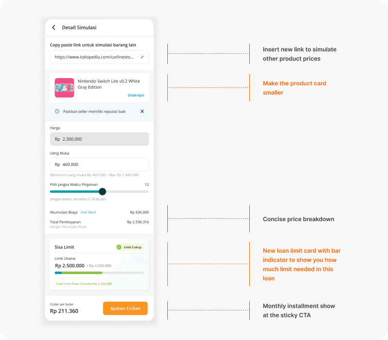
Based on our research and testing, we made several design changes:

Design deliverables

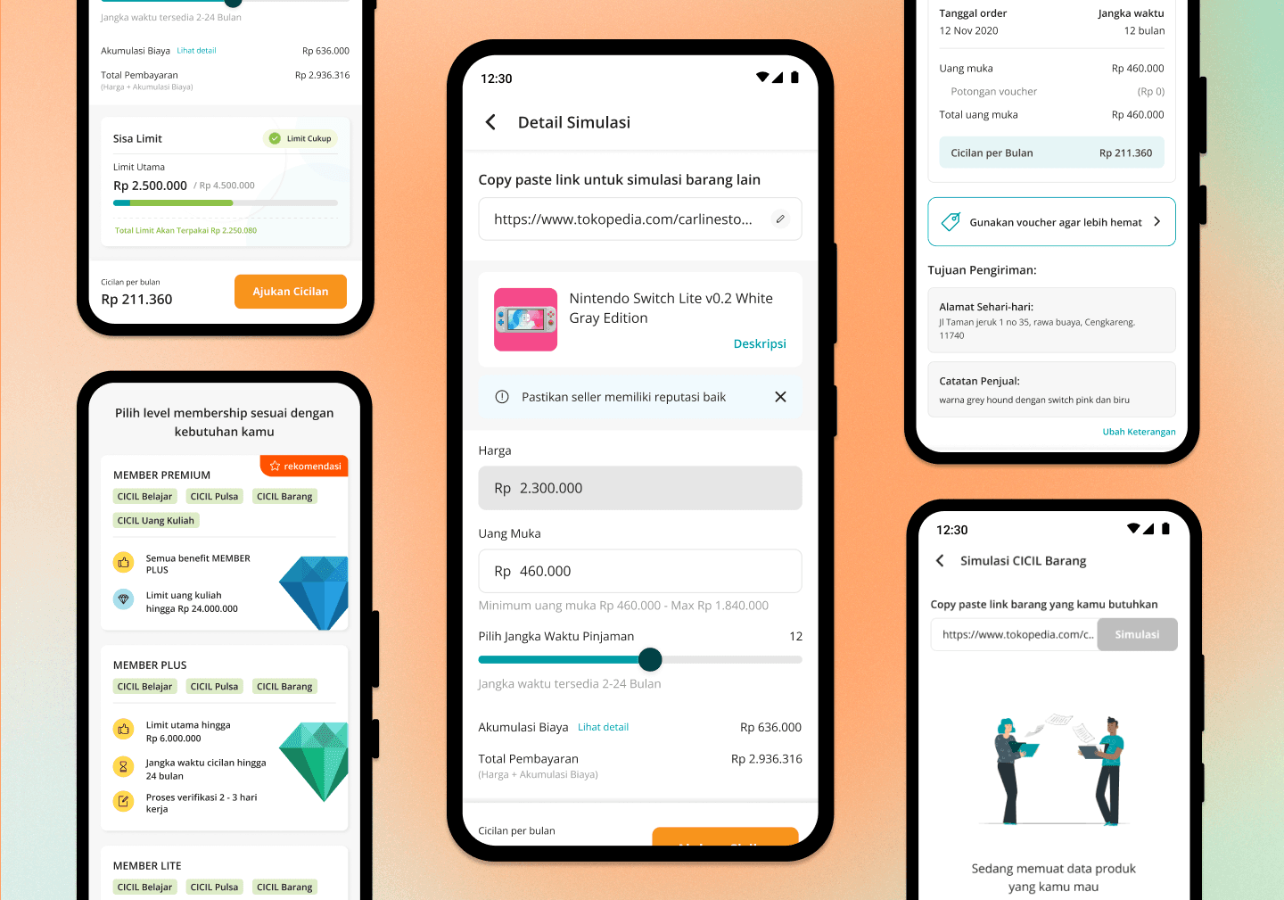
Visually Fresher Design

Visually Fresher Design

Simplified UI to make the experience easier for users.

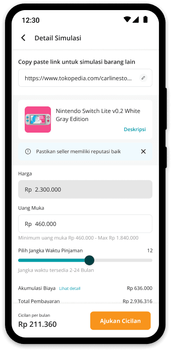
Copy paste link untuk simulasi barang lain

Rp

2.300.000

Harga

https://www.tokopedia.com/carlinesto...

Detail Simulasi

Jangka waktu tersedia 2-24 Bulan

Pilih Jangka Waktu Pinjaman

12

Akumulasi Biaya

Rp 636.000

Lihat detail

Total Pembayaran

Rp 2.936.316

(Harga + Akumulasi Biaya)

Rp

460.000

Uang Muka

Minimum uang muka Rp 460.000 - Max Rp 1.840.000

Pastikan seller memiliki reputasi baik

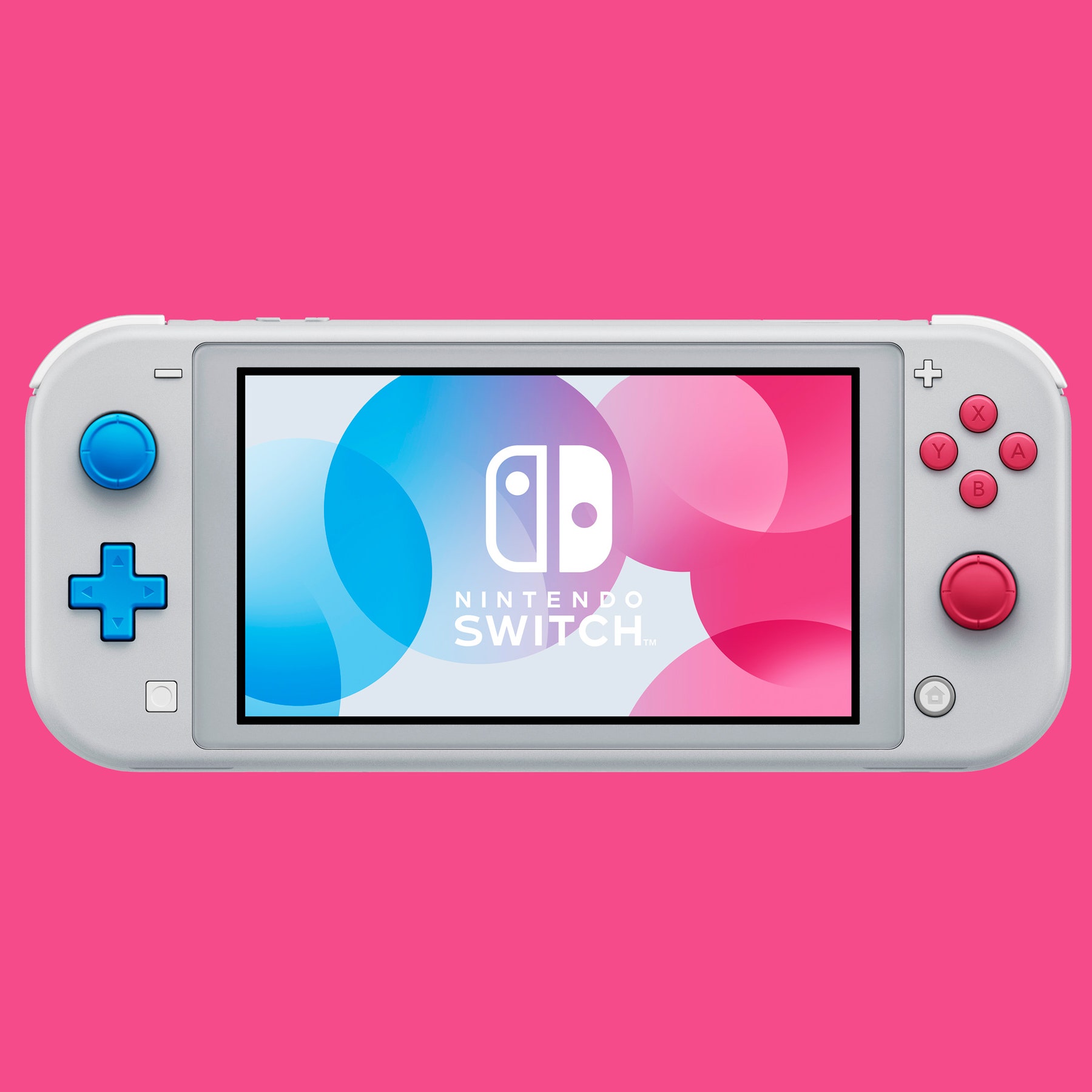
Nintendo Switch Lite v0.2 White Gray Edition

Deskripsi
Ajukan Cicilan

Cicilan per bulan

Rp 211.360

Every section crafted with user-centered mindset

Every section crafted with user-centered mindset

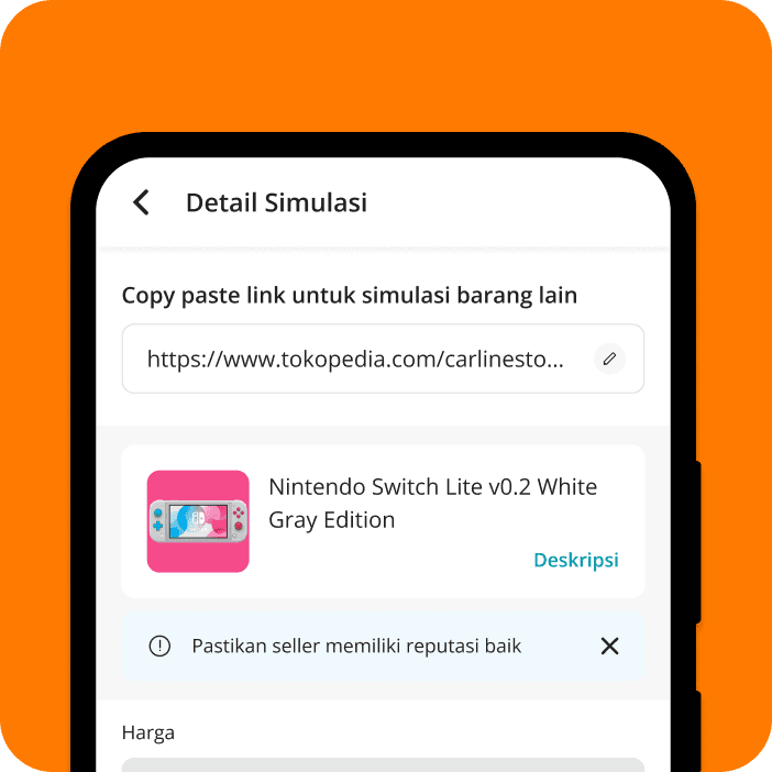
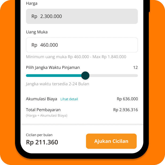
As we found out that our users like to try different link to simulate the price, we understand that it is one of the reason that our drop rate is high. Adding shortcut link crawler form is the key to make the experience seamless and reduce drops.

Deliverables 1

We understand that users came to our app with clear intention to buy specific product, not browsing

We understand that users came to our app with clear intention to buy specific product, not browsing

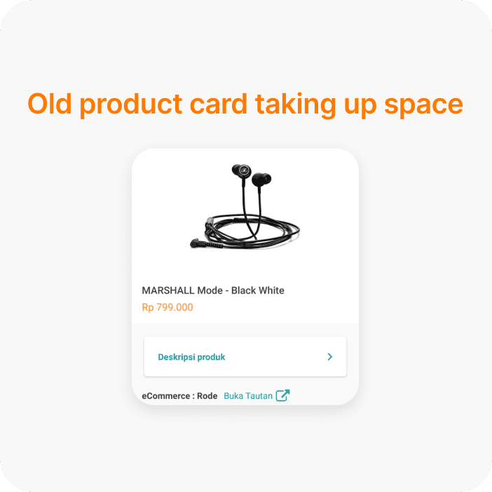
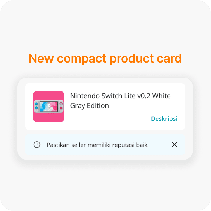
We're not marketplace. We're 3rd party payment app. Users came to our app with specific mental model. They already knew the stuff they want to buy after browsing in the marketplace. Instead of making the product card taking up half of the space, we decided to cut a lot of unimportant informations and make it more compact.

Deliverables 2

Switch link whenever you want

Switch link whenever you want

Users can switch links to simulate different prices seamlessly.

Deliverables 3

Deliverables 3

Decluttered loan breakdown

Decluttered loan breakdown

Combined variables into "Cost Accumulations" with a detailed view available on click.

Deliverables 4

Deliverables 4

New and improved limit card

New and improved limit card

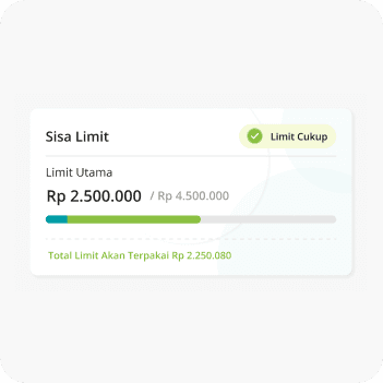
Visual cues replaced confusing numbers, indicating available limit usage clearly.

How it used to be

How it used to be

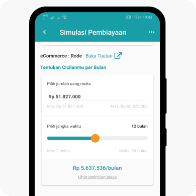
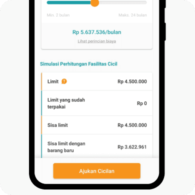
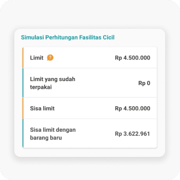
Full of numbers that doesnt make sense if we really count it. It looks like a multiplication but its not. The number is all over the place if we count it while all the student care is can they still purchase this product with the current limit.

Now its easier to scan quickly

Now its easier to scan quickly

Green indicates how much limit will be used on your current available limit. Adding checklist indicator to make it clearer.
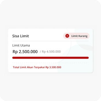
If students run out of limit. they cannot continue with the checkout. Increase the downpayment or buy cheaper stuff

Swipe the image to see overlimit state
Bonus explorations

Bonus explorations

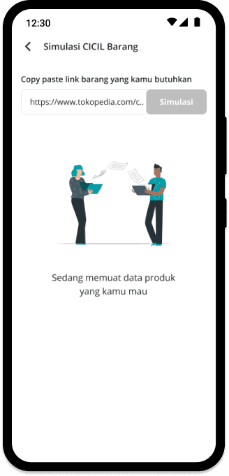
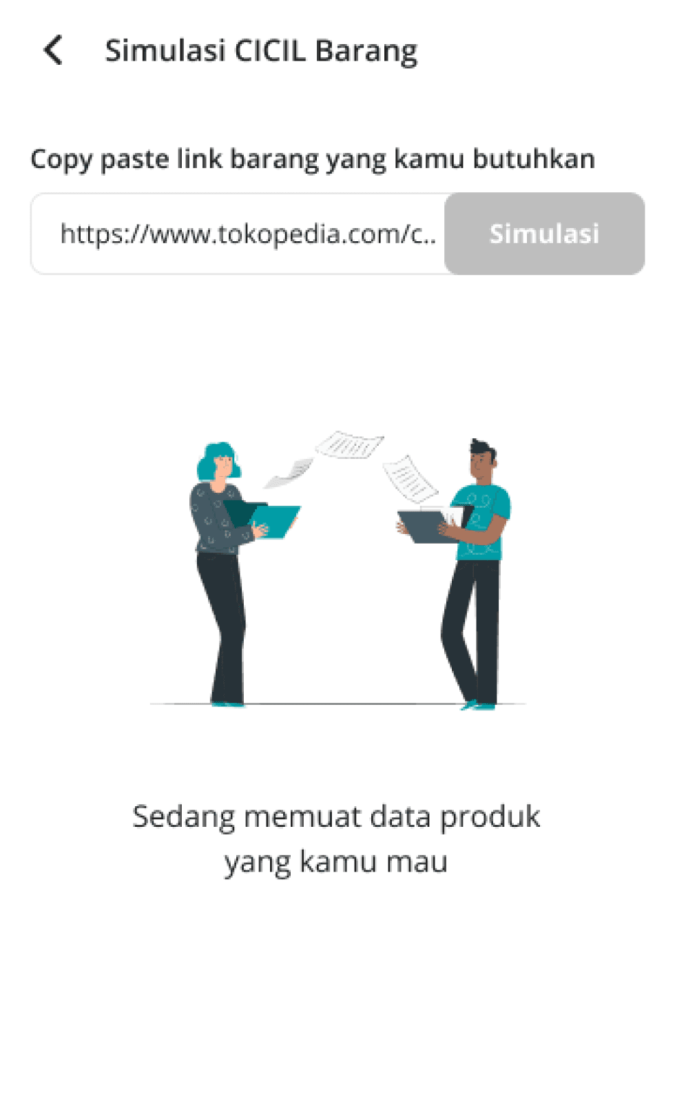
Adding loading animations to make it more fun

Adding loading animations to make it more fun

Some students who lives in rural area might sometimes facing a longer load while crawling the product from other marketplace. Im trying to emphatize with their waiting time and add a loading animations to make them feels that the loading is happening.

Chapter 3. Learning

Chapter 3. Learning

Learning and take aways

Learning and take aways

This project, my biggest solo project so far at CICIL, taught me a lot about communication with PMs, engineers, internal stakeholders, and users. Starting just 4-5 months after joining CICIL (my first full-time job as a Product Designer), I learned to craft good visuals, communicate my design, take criticism, and understand user needs.

60.5%

Reduced drop rate

Reduced drop rate

24.7%

increase in user satisfaction

increase in user satisfaction

32.8%

faster conversion rate

faster conversion rate

60,5%

Feels cleaner and easier

Feels cleaner and easier